How To Track Your Sales Performance On KarryBiz
Do you actually know — to the naira — how much revenue you have generated this month? Which of your products is driving the most sales? Whether you have more loyal repeat customers this month than last month? Whether your profit margin is going up or quietly shrinking?
If the honest answer is no, like many others you are not alone. Most small business owners in Nigeria operate on gut feeling, rough mental estimates, and the general vibe of how busy their WhatsApp is. And for a while, that works. Until it doesn’t.
Because here is the thing: you cannot grow what you cannot see. You cannot fix what you don’t know is broken. And you cannot make confident decisions without real information to back them up.
That is exactly why KarryBiz built the Business Analytics dashboard — a tool that tracks your sales performance automatically, in real time, and presents it in a format that any seller can understand and act on. No spreadsheets. No accountant. No guesswork.
In this guide, we are going to walk through exactly how to track your sales performance on KarryBiz; and more importantly, how to turn what you see into decisions that actually move your business forward.

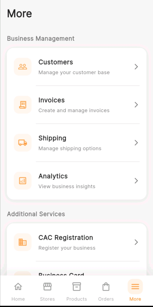
How To Get There: Accessing Your Analytics
From the bottom navigation bar in the KarryBiz app, tap “More.”
Under the Business Management section, tap “Analytics” — View business insights.
Your Business Analytics page opens. This is your command centre.
Understanding The Business Analytics Dashboard
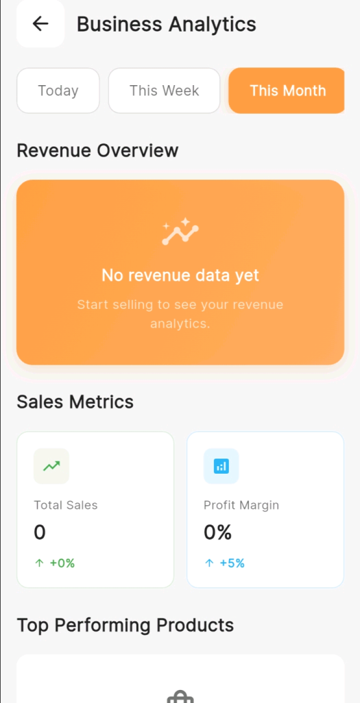
Section 1: Time Filter (Choose Your Analysis Period)
At the very top of the Business Analytics page, you will see three time filter buttons:
• Today.
• This Week.
• This Month (highlighted in orange — selected by default).
These filters control which time period all the data on the page reflects. Tapping any of the three buttons instantly updates every metric, chart, and insight below to show data for that specific period.
How To Use The Time Filter:
• Today: Use this to get a snapshot of the current day’s performance. How many orders have come in today? What revenue has been generated so far? Useful for monitoring daily activity and staying on top of what is happening right now.
• This Week: Use this for a week-in-progress view. Ideal for mid-week check-ins to see if the week is on track and whether any action is needed to hit your targets before the weekend.
• This Month: The default view and the most commonly useful. This gives you a complete picture of your current month’s performance — how sales are trending, how many new customers you have acquired, and how your key metrics compare to last month.
Section 2: Revenue Overview — Your Financial Pulse
Directly below the time filter, the Revenue Overview section displays your store’s revenue performance for the selected period.
When you have active sales, this section shows:
• A revenue trend graph: a visual chart showing how your revenue has moved over the selected time period.
• Total revenue figure: the exact amount generated in the selected period.
• Trend indicator: whether revenue is up or down compared to the previous equivalent period.
• When your store is new or has no sales for the selected period, the dashboard displays: “No revenue data yet.”
“Start selling to see your revenue analytics.”
Note: This is completely normal for new stores — it is simply KarryBiz prompting you that the data will populate as soon as orders are processed.
Section 3: Sales Metrics
Below the Revenue Overview, the Sales Metrics section presents two essential performance indicators displayed as side-by-side metric cards: displaying total sales and profit margins in percentage from every sales.
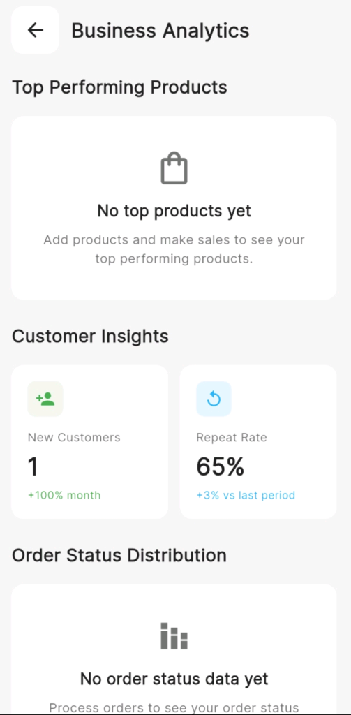
Section 4: Top Performing Products
The Top Performing Products section identifies which of your listed products are generating the most sales and revenue.
When you have active sales, this section displays a ranked list of your best-selling products — showing each product’s name, the number of units sold, and the revenue generated.
Section 5: Customer Insights (Understanding Who Is Buying)
The Customer Insights section provides two critical metrics about your customer base — presented as side-by-side metric cards with trend indicators. The trend indicators shows the rate of customers acquisition and the frequency at which they patronize your business.
Section 6: Order Status Distribution (Track Your Operational Health)
The Order Status Distribution section provides a breakdown of your orders by their current status — showing what proportion of your orders are pending, processing, shipped, delivered, or cancelled.
Final Thoughts
Your KarryBiz analytics dashboard is telling you a story every single week — a story about what is working, what isn’t, what your customers love, and where your biggest opportunities are hiding. The sellers who read that story carefully and act on it consistently are the ones whose businesses look dramatically different twelve months from now.
The data is there and it is free. It updates in real time. And it is waiting for you right now in your KarryBiz app.
Open it today. Read what it is telling you. Write down one thing you are going to do differently because of what you saw.